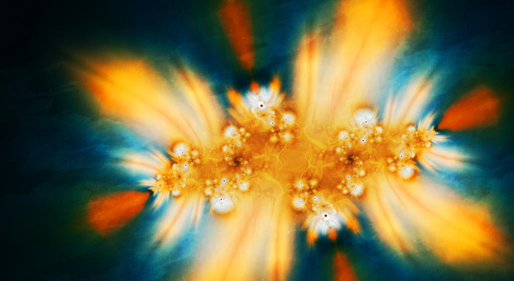
I had a long day at work so this critique will be in list form. <img src="
e.deviantart.net/emoticons/let…" width="15" height="15" alt="
")
" title="
(Lick)"/>
The good:
<img src="
e.deviantart.net/emoticons/b/b…" width="10" height="10" alt="

" title="Bullet; Red"/> Your hue variance. A lot of times when people pair complementary colors like gold and blue, they leave out everything else. But here, in the dark areas, they mix to create a greenish tone, and in the bright areas, pinkish-peach goes through. The subtle hue shifts add a lot to the more obvious, dramatic blue v. gold contrast.
<img src="
e.deviantart.net/emoticons/b/b…" width="10" height="10" alt="
" title="Bullet; Red"/> Textures, especially in download view.
The bad:
<img src="
e.deviantart.net/emoticons/b/b…" width="10" height="10" alt="
" title="Bullet; Red"/> Your value variance. Though you have a good balance of light and dark, it seems that everything is either very bright or very dark with little exploration of the midtones. Even though I know you don't postprocess very much, it almost looks like this one got overcontrasted in photoshop or something.
<img src="
e.deviantart.net/emoticons/b/b…" width="10" height="10" alt="
" title="Bullet; Red"/> What are those little black spots at the center of the bright points? They're obnoxious and you are usually better at getting rid of that stuff. Did you leave "repeat gradient" checked on accident or something? If the gradient is just being really difficult and you shrunk them as much as possible, maybe try masking them out?
The I'm-not-sure:
<img src="
e.deviantart.net/emoticons/b/b…" width="10" height="10" alt="
" title="Bullet; Red"/> I usually don't like zoomed-out julia-esque fractals because they get too repetitious. There's self similarity, and then there's "once you've seen one part, you've seen it all." Part of the difficulty of fractals is straddling that line, I think. Anyway, I kind of feel like the exact rotational symmetry is hurting you here. I oftentimes try to obscure/vary those exactly self-similar structures by adding a layer that doesn't follow the pattern or using limited iterations or something. HOWEVER. I'm not 100% sure if that is the right course of action for this fractal. Varying it too much might lessen the bold statement of the image, and that would not be good. Sometimes, simple
is better... <img src="
e.deviantart.net/emoticons/h/h…" width="15" height="15" alt="

" title="hmm"/> So, maybe vary it up a little bit but not enough to really obscure the structure? Even just a small iteration-dependent color-tweak would go a long way, I think.


")
